Pepsi Logo Parody
In 2009, Pepsi updated their logo to have the little wide gap between the red and white. Lawrence Yang from Suck At Life.com created this parody. |
Listed with permission from Lawrence Yang - blowatlife.blogspot.com
Economic Crisis Logos
2008 will go down in history as one of the worst years for economies around the world. Despite the record number of companies collapsing, down-sizing around the world, there will always be someone to find humour in such events. I received a collection of logo parodies of some of the large companies in the world such as Ford, Chrysler, Nike, Apple etc. I hope you find these logo parodies funny. I know I did. I am not sure who created these logos so if you want acknowledgment or want me to remove the logo, please let me know.

Renault Logo - Design and History
Renault is a French automaker producing cars, vans, buses, tractors, and trucks. Due to its alliance with Nissan, it is currently the world's 4th largest automaker behind General Motors, Toyota and Ford. It owns the Romanian automaker Dacia and the Korean automaker Renault Samsung Motors. The company is well known for numerous revolutionary designs, security technologies, and motor racing. Producing cars since late 1898, the Renault corporation was founded in 1899 as Société Renault Frères by Louis Renault, his brothers Marcel and Fernand, and his friends Thomas Evert and Julian Wyer.
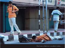
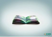
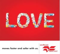
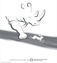
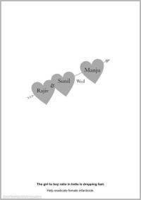
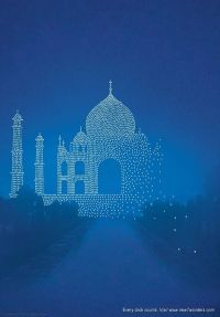
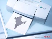
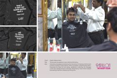
Advertising in India
The Indian print and television advertising agencies are pretty creative in my opinion. Some of the ads that I see on TV and in the newspaper are on par with the commercials here in the United States. A friend of mine sent me these images of some funny print advertisements from India and I thought I would share it with everyone. Some of the these advertisements are commercial in nature and some of them have a social message. In order to view the full image, click on the image below and it will open up in a bigger window. Enjoy.


Bharti Enterprise Logo - Design and History
| Bharti Enterprises is one of India€™s leading business groups with interests in telecom, agri business, financial services and retail. Bharti has been a pioneering force in the telecom sector with many firsts and innovations to its credit. Bharti Airtel Limited, a group company, is one of India€™s leading private sector providers of telecommunications services with over 80 million customers as of end of October 2008, spanning Mobile services, Telemedia services and Enterprise services. Bharti Airtel Limited has been voted as India's most innovative company, in a survey conducted by The Wall Street Journal. In November 2008, Bharti Enterprise unveiled a new logo. Bharti said that with the new logo, the group aims to get a facelift with fresh and youthful brand logo which reflects a multi-dimensional character that seeks out new avenues to grow. Revealing the choice of colors for the new logo, the group said that the colour Indigo blue signifies Depth and Orange stands for Youthful Passion and Energy, the Arrowheads stand for Movement that Extends over Boundaries and symbolises Swiftness, Precision and Accuracy. |
Bharti Enterprises has unveiled its new brand identity with a new logo and a vision to become "India's finest conglomerate" by 2020. Bharti aims to achieve this by creating 'Big Transformations through Brave Actions', which is its new slogan.
Druk Air Logo - Design and History
|
Druk Air Corporation Limited, operating as Drukair - Royal Bhutan Airlines, is the national airline of the Kingdom of Bhutan and operates a modest scheduled flight network within the South Asian region from its base at Paro Airport in the western dzongkhag of Paro. Taking its name from Druk, the airline was founded in 1981, ten years after Druk Gyalpo His Majesty King Jigme Dorji Wangchuck gradually began to open up the Kingdom from self-imposed isolation, and seven years after welcoming its first foreign visitors. As the only airline flying into Bhutan, Drukair has become a lifeline with the outside world for the Bhutanese people, as well as supporting emerging inbound tourism and export markets. |
The name and logo of the airline is based on Druk, the Thunder Dragon of Bhutanese mythology. Druk is a Bhutanese national symbol, and therefore very significant in Bhutan. The Druk is central on the Bhutanese Flag, holding jewels to represent wealth. In Dzongkha, Bhutan is called Druk Yul, or Land of Druk. The Bhutanese leaders are known as Druk Gyalpo - Dragon Kings - because of Druk.