2012 NCAA Mens Final Four Logo - Design and History
| The 2012 NCAA Men's Division I Basketball Tournament is a single-elimination tournament involving 68 schools playing to determine the national champion of men's NCAA Division I college basketball. It began on March 13, 2012 and will conclude with the championship game on April 2 at the Mercedes-Benz Superdome in New Orleans. The event is also popularly known as March Madness because most of the US gets completely involved in this contest with a number of office and online pools going on. With no other major sporting event in the US at this time, its the most discussed event in March. |
The logo for the 2012 Final Four is shown above and its pretty bland with little to no creativity (see some of the older logos below)
- The logo has the NCAA along with the basketball
- It has the 2012 Final Four and finally
- the location of the event - New Orleans. The colors and the decorations around New Orleans are Black and Gold which are the colors of the New Orleans Saints.
Hope the games are more exciting than the logo. Click the Read More link below for historical logos.
Read more: 2012 NCAA Mens Final Four Logo - Design and History
Trip to Montevideo - Day 0
 |
|
Football fans from India will recognize Uruguay because of their success in the last World Cup and their soccer stars Luis Suarez (at Liverpool) and Diego Forlan (Inter). For those who don't know where Uruguay is, its located on the Eastern coast of South America, just south of Brazil and east of Argentina. Very few Indians probably make the trip to this country as its too far away and probably not a major tourist attraction. Most Indians who prefer the more popular destinations like the US, Europe, Australia and the Far East. Fortunately for me, the company I work for has an office in Montevideo, the capital and I get to visit this less visited country. Over the next few days, I will share my experiences of life in Montevideo from the eyes of someone from India. Let me see what things Desi I can find here. If you would like to take this journey, follow me on Twitter. |
I will begin with Day 0, getting to Montevideo. I took a flight from the US and in most cases, the best way to get directly into Montevideo was from Miami via American Airlines. The flights to Montevideo are usually red-eye flights and the travel time is about 9-10 hours. Getting to the gate, I realized that Uruguayans, like Indians, like to shop a lot abroad because the cost of luxury goods is almost twice the price in their home country. There were lots of duty-free shopping bags waiting to be handed to the passengers as they boarded their flights.
Once you get into the plane, you realize that most of the US airlines reserve their older aircrafts to fly to these countries. Much like how flights to India are, where the European legs have newer planes but the leg to India is nothing more than a flying bus. They probably played a movie and turned off the entertainment for the rest of the flight. Fortunately the plane was quite empty and being tired and and sleepy, was able to stretch my feet and get a good nap.
After about a 10 hour flight, we arrived at the Carrasco International airport. I had imagined a much bigger airport like the size of Bangalore or Hyderabad perhaps but it was really small and has only 4 gates. The airport is really modern and highly rated. It was very clean, with clearly marked signs etc. I made it through immigration smoothly. With only 4 gates, not too many flights can arrive at the same time. My suitcase was really light because I just had my clothes, but the locals all had a couple of really heavy bags. I found out on my flight that many Latin Americans find it cheaper to fly to Miami and shop for goods there and many make a trip there just for the purpose of shopping. Kind of like Dubai and Singapore for many Indians.
I came outside to find my cab driver waiting for me. In speaking with him, I realized that I am in for some fun not knowing any Spanish except Uno, Dos, Tres (which may be from a Ricky Martin song?) and No Habla Espanol (I dont know Spanish). The driver knew no English but of course he knew where to go so I made it safely to the hotel. My team speaks excellent English but its seems like the locals do not know the language at all. Guess, my hands will have to do the talking.
The ride to the hotel was quite short so I got to the see just the outskirts of the city. My first impressions of this part of the city was Mumbai meets Bangalore (but from 25 years ago). Being on the coast, the weather is really humid and you can feel it everywhere. This, along with the sea-breeze reminded me of Mumbai. The bungalows and greenery reminded me of Bangalore.
Feeling a bit tired, I decided to take a short nap before venturing out for lunch and other adventures. More to follow tomorrow, stay tuned. So far, no sign of anything Indian here but I will be looking.


2012 NBA All-Star Game
|
The 2012 NBA All-Star Game is an exhibition basketball game between players selected from the league's Western Conference and the Eastern Conference that will be played on February 26, 2012 at the Amway Center in Orlando, Floria. The game will be the 61st edition of the National Basketball Association (NBA) All-Star Game and will be played during the 2011€“12 NBA season. Orlando will hosting the event for the 2nd time in its history. |
The Logo for the event is shown above and the following are some of the key elements in the logo.
- The key aspect of the logo is the shooting star in light blue and black colors, which are also the primary colors of the Orlando magic logo. The Star is prominent to reflect the "All Star" Game.
- The Star has the pattern and shape of the basketball as well.
- The big Star also has a 3 small stars on it which have been taken from the Orlando Magic logo (perhaps to reflect the magic of Disney)
- The All Star font is very not the same as the one used by the Magic but does remind me of something that I am unable to pin down as I write this post.
- The location - Orlando 2012 is also prominent at the bottom and the NBA logo is thrown in the middle.
Overall, its a very ordinary logo. The logo does not reflect much about the city of Orlando (except perhaps the Disney magic stars). The colors are fairly dull as well. Hope the game, dunk contest and other events are more entertaining than the logo.
See the history and design of some NBA Logos.
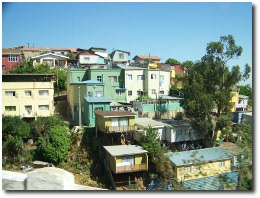
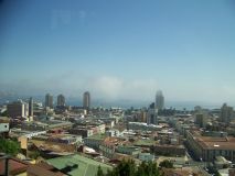
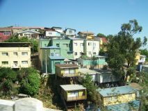
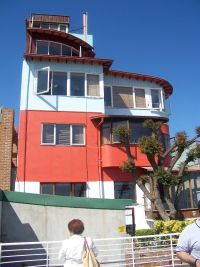
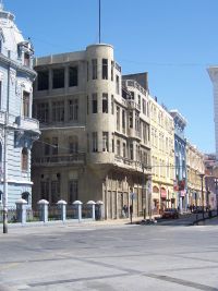
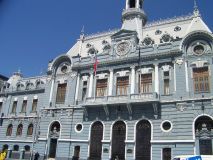
Valparaiso and Curacavi - Two cities forever changed in Chile
 |
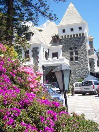
I was recently in Chile on a business trip and had some free time on the weekend to take a trip to the coast side cities of Vina Del Mar and Valparaiso. During the trip, the tour guide told us about 2 cities that changed forever because of the innovation. The innovation of faster travel and the building of the Panama Canal. The two towns that were affected were Curacavi and Valparaiso, both less than 150 kms from the capital, Santiago. Curacavi - Curacavi is a little town that lies between Santiago and Valparaiso. Before the advent of cars and trains, the travelers would travel on horse driven carts that would take between 2-3 days to cover the 100 kilometer distance. On the way, Curacavi was an important stop for the travelers to have food and an overnight stay. This city flourished because of these travelers who were going back and forth between Valparaiso and Santiago. With the advent of the car and trains, the travel times were reduced to hours and no one stopped at Curacavi any more. This city was devastated by this and has never recovered from this. Today the valley of Curacavi is used for wine producing and has regained a bit but will probably never see the glory days again. |
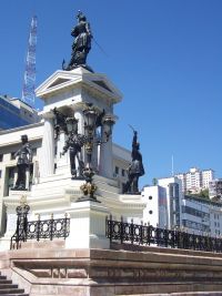
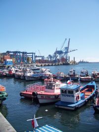
Valparaiso - Valparaiso is a port city about 100 kilometers south of Santiago. Before the Panama Canal was built, Valparaiso was an important port because all ships that had to go from the Pacific to the Atlantic would dock at Valparaiso. The ships typically had to go to Cape Horn to get around the continent of South America. The town flourished because of fact that there was no way to get around the continent. When you visit the city, you can see that the town was really well off in the past. The port has some old and impressive looking buildings and you can sense that this was a flourishing town. In 1914, the US opened up the Panama Canal which allowed most of the ships to go through Panama thereby cutting the number of ships coming to Valparaiso significantly. This city too was devastated by this. Today, Valparaiso is still an important port and many cruise lines use this city as a starting point for their South American cruises. However, its probably a shadow of its former self.
The Panama Canal, Suez Canal, advent of faster travel must have had devastating impacts on many cities and it was fascinating to think and see the impact. Fortunately, these are not ghost towns and continue to live. I wonder how future innovation may impact some major city in the world today. Will planes of tomorrow be able to fly longer distances thereby eliminating or reducing traffic to some of the major hubs. Will high speed rail have an impact on air travel? Something to think about.


Ferrari Logo - Design and History
JC Penney Logo - Design and History
|
|
J. C. Penney Company, Inc. is a chain of American mid-range department stores based in Plano, Texas, a suburb north of Dallas. The company operates over 1100 department stores in all 50 U.S. states and Puerto Rico. JC Penney has been in business for over 75 years now and is one of the most widely recognized brands in the United States. In Jan 2012, JC Penney unveiled a new logo, shown alongside to go with their new policy of more standardize pricing, which they called "Fair and Square". The new logo and rebranding effort comes just a year after their last rebranding effort. The main aspects of the logo as below - the letters 'jcp' now appear in a blue box on top of a red square frame. In the previous design, the 'jcp' was in a red frame next to the 'enny' which was in a white box and looked a bit odd. Separating the 'jcp' makes it clear. |
The new logo design does not excite me at all. Adding the blue into the mix take away focus from the logo. There is a lot of white space that is wasted in the logo as well. While the new logo may look OK in print or on a website, I am not sure how they would update their stores with this logo.
The reactions to the logo have been mainly negative but only time will tell if the new branding and the pricing model were effective.