Olympic Logos
2012 London Summer Olympics Logo - Design and History
- Details
- Parent Category: History of Logos
- Category: Olympics Logos
- Hits: 7124
|
|
The 2012 Summer Olympic Games, officially the Games of the XXX Olympiad, and also known as London 2012 are scheduled to take place in London, United Kingdom, from 27 July to 12 August 2012. The Olympic games are a major international event in which thousands of athletes from around the globe participate in various sporting events. These include sports such as swimming, track and field, football, basketball and numerous other events. The summer Olympic games are one of the most watched television events and cities around the world compete fiercely to host an Olympic event. |
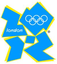
Controversy : Since the logo was unveiled, there have been a number of controversies surrounding the logo
- Iran said it would boycott the games because the logo appeared to spell the word "ZION", a biblical term that refers to Jerusalem.
- Some have complained that the logo looks like a distorted Swastika.
- Some users complained of having seizures after watching the logo on TV changing colors.
- Perhaps the most absurd one is some users with really wild imaginations have suggested that the 0 is a silhouette of Lisa Simpson performing a sexual act on the number 2. If you look closely, perhaps, but really? Was the logo designer so perverted? Maybe she is just speaking into a microphone.
The logo is fairly simple and uninspiring. London has so many wonderful monuments such as the London Eye, the Buckingham Palace or Big Ben (or Elizabeth Tower as it is now called) that could have been incorporated into the logo. Hopefully the games will be significantly more exciting with Bolt and Phelps in it.
Sources:
See more World Famous Logos
Technology Logos
Car Logos
Logo Parodies