2011 ICC Cricket World Cup Logo Design
The 2011 ICC Cricket World Cup will be the tenth Cricket World Cup, and will be hosted by three South Asian Test cricket playing countries; India, Sri Lanka and Bangladesh. It will be Bangladesh's first time co-hosting a Cricket World Cup. The World Cup will use cricket's One Day International format, with fourteen national cricket teams scheduled to compete. The World Cup will take place during the months of February and March 2011, with the first match being played on 19 February 2011.
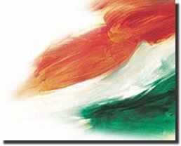
The event has a theme called "Celebration of Cricket" and the logo represents the theme. The logo is in the shape of a cricket ball with an upright green seam and both the sides represent a crowd that is a part of the action, with the hands up, cheering and shouting for their team.
The green seam indicates the one day ball and the green of the pitch and ground. The players and crowd surround this with motion and activity. The colours and figures on each side of the ball represent the event host nations coming together along with the world of cricket. The colour and movement creates a festival, players and fans coming together from around the world to celebrate cricket in the sub-continent.
The logo was unveiled on July 14th in Mumbai and was designed by Australian creative firm Witekite, one of 12 companies from all over the world that submitted concepts. The logo, in the shape of a cricket ball, is intended to reflect all that is best about cricket in the sub-continent - colour, movement and action.
I really love the logo as it represents the energy of the crowds in the sub-continents will bring to the event. The shapes in the logo also have a very Indian touch to it.
Indian Website Directory
 | While many visitors come to dinesh.com for the logo information and jokes, the site was started on the basis of the Indian Web Directory which was a collection of the best and most popular Indian websites. Over the years, many of those sites have disappeared and many new sites have come up. We have just gone through our directory and cleaned up a lot of the dead links and added many new links as well. We hope you find these updates useful. The following sections were updated |
- Maps and Views
- News and Media
- Real Estate
- Recreation and Sports
- Science and Environment
- Shopping
- Society and Culture
- States
- Transportation
- Travel and Tourism
- Weather
Some of the other nice features of our web directory are
- Thumbail Preview for most of the sites, so you can preview the site before clicking on it
- Ability to provide a rating so that other can benefit from your experience
- Ability to register and manage your own sites
- Ability to write a review for the sites.
You can register your sites now.
Global Desi Yellow Pages
 | | We launched our food site, Indian Foods Guide , two years ago dedicated to the best food on the planet, Indian Food. Within that time it has become one of the popular sites among fans of Indian food. With the success of that, we have now launched our new site - Desi Yellow Pages on videsh.com. The Desi Yellow pages site is built around putting together a Yellow Pages Directory of Indian/Pakistani and Bangladeshi business around the world. We have seen many local Yellow Pages directories but not one that is dedicated to Desi Businesses around the globe. You will find desi businesses from the popular countries the United States, Canada and the United Kingdom as well as from lesser known places such as Nigeria, Ghana, Vietnam etc. |
We have a number of Business categories such as
- Desi Arts and Entertainment
- Desi Associations
- Desi Beauty Salons
- Desi Boutiques
- Desi Dance and Music Schools
- Desi Driving Schools
- Desi Movie Theaters
- Desi Religious Organizations
- Desi Student Associations
- Desi Jewellers
- Desi Wedding and Event Planners
You can also join us on Facebook and Twitter
Economic Crisis Logos
| Indian food is among the most popular cuisines around the world and IT in India is among the fastest growing professions as well. Someone had the bright idea of combining the two and the results can be seen below. Some are quite funny especially the interpretation of that MindTree logo shown alongside. |
Bharti Airtel Logo - Design and History
| |
| Bharti Airtel is the world's fifth largest telecommunication company and has more than 150 million users in India, 40 million in Africa and another 10 million in Bangladesh and Sri Lanka. In November 2010, Airtel said its subscriber base has crossed the 200 million mark and unveiled a new logo to mark the achievement. The logo as shown alongside is a modern representation of the letter 'a' on a bright red background. Here are some notes and comments from Bharti on their design
|
- The logo has been designed by creative agency JWT
- The entire re-branding campaign has apparently cost the company close to Rs 300-Crore
- A new theme tune, composed by A.R Rehman has also been released
Time Warner Cable Logo - Design and History
|
Time Warner Cable 2010 Logo |
Time Warner Cable Old Logo |
Time Warner Cable is an American national cable television company that operates in 27 states and has 31 operating divisions. In an effort to modernize its brand, Time Warner Cable revealed a redesigned logo in October 2010.
Time Warner Cable has kept its iconic eye and ear graphic, though it's emphasis is much more significant than before. In the old design, the symbol was only a small part of a long, rectangular logo. Now, the design is more square-shaped and the ear and eye graphic accounts for nearly half of the overall logo. Additionally, the logo uses a vibrant baby blue instead of the diluted navy color from its previous logo. Also, the word "cable" now holds the same weight as the words "Time Warner," which could indicate the company is putting renewed focus on its cable offerings.
Based on the design changes, I feel that this is not a major rehaul of their logo but small enough to maybe make a difference in the branding.
Some other notes on the logo -
- The new typeface uses a font based heavily on Stag Sans Round by Christian Schwartz
- The national cable company worked with design agency The Brand Union, which is owned by WPP.
Car Logo Parodies
World Famous Logos
More Car Logos
The respective logos are registered trademarks. Use of the logo here does not imply endorsement of the organization by this site.