Pittsburgh Steelers Logo - Design and History
|
The Pittsburgh Steelers are a professional American football team based in Pittsburgh, Pennsylvania. Founded in 1933, the Steelers are the oldest franchise in the AFC. Pittsburgh has won more Super Bowl titles (six), won more AFC Championship Games (eight) and played in (fifteen) and hosted more (eleven) conference championship games than any other AFC or NFC team. The Steelers won their most recent championship, Super Bowl XLIII, on February 1, 2009. Have you ever wondered what their logo stood for? The Pittsburgh Steelers were not always the Steelers, they were originally called the Pittsburgh Pirates by the founder Arthur (Art) Joseph Rooney. In 1933, fans were encouraged to send their suggestions to the team and several nominated the winning name Steelers, after steel, which was the main source of employment in Pittsburgh. Pittsburgh is also referred to as the Steel City. |
The logo was born in 1962 when the Republic Steel of Cleveland approached the Steelers and suggested that they consider the Steelmark, the insignia used by the American Iron and Steel Institute (AISI), as a helmet logo to honor Pittsburgh's steel heritage. The Steelmark logo, a circle enclosing three diamonds with inward-curving edges (see image on left) and the word 'Steel', was created by U.S. Steel Corp to educate consumers about the importance of steel in their daily lives.
Microsoft Logo Design and History
![]()
|
Microsoft Corporation is an American multinational corporation headquartered in Redmond, Washington, United States that develops, manufactures, licenses and supports a wide range of products and services related to computing. The company was founded by Bill Gates and Paul Allen on April 4, 1975. Microsoft is the world's largest software maker measured by revenues. It is also one of the world's most valuable companies. In Aug 2012, Microsoft unveiled its updated logo (shown above) which is essenially a simplified version of the Windows logo. The Windows logo had the four colors, Blue, Orange, Green and Yellow in the form of a wave. However with the Microsoft logo, they are simple square blocks. In addition, the Microsoft font is no longer italicized but a simpler lighter type font. The font is the Segoe font, which is a font that Microsoft had created and uses in its products and marketing materials for many years. The font apparently figures prominently in the new Windows 8 interface as well. The one element that they have retained from the previous logo is the connection between the letters 'f' and 't'. Overall, since we have seen the Windows logo for so many years, its hardly a noticable change and perhaps some readers may even wonder, "Isn't that how the logo was in the first place?". The company is at an important point in their history with the launch of Windows 8. Hopefully the product is a much bigger success than this logo. |
Thank you NBC #NBCFail
|
The 2012 London Olympics are being watched live by millions of viewers around the world but we in America are in a unique situation where NBC is showing most of the events on tape delay. While most Americans are unhappy with this situation are are tweeting with the hashtag #NBCFail, I would like to send a few Thank you notes to the wonderful staff at NBC.
|
- Thank you for teaching my 6-year old new words like neutering - Thanks to the incessant replay of the same commercials, my 6 year old has picked up new words such as 'neutering'. I am sure his teacher would be proud of his improved vocabulary once he returns to school from his summer break.
- Thank you for freeing up my evenings in the Fall - You ran so many ads of your Fall shows during the games that I know NBC will not be on in prime time this Fall. You will continue to be in last place this Fall.
PS: The Thank You notes concept is taken from Late Night with Jimmy Fallon Show, ironically on NBC
7 Stages of Balding
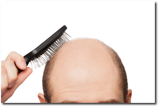
Whoever said "In life, death and taxes are inevitable" was probably a balding man in denial. As a man who is currently going through this process and watching his friends go through this, the balding process can be categorized into 7 stages. Why seven you ask? Having read many books by management gurus (or quacks), I learnt that 7 stages is more powerful than any other number. This blog post will get more validity because its a seven stage process. The seven stages are described below.
1. Denial - For most men, the balding process probably starts in their late 30s to late 40s. One tends to notice that they are losing their hair but most choose to live in denial. Perhaps, you can feel the barber gingerly cutting the hair on certain parts of your head, perhaps the water feels more in touch with the skin on your head or perhaps you can see your hair line receding in your pictures. You notice this with all your friends, but when it comes to you "Nah! It cannot be happening to me".
How much will I earn with Google Adsense?

If you are here thinking that you can put together a website, put some Google Ads, sit back and earn millions of dollars, then you can end reading this article at this point. If on the other hand, you are willing to invest time and effort to create a website with valuable content, then perhaps this article will be of interest to you. I have been using Google Adsense on my website for close to 8 years now and having been earning some money with Adsense. Many readers ask me how much can I earn with Adsense. The truth is there is no right answer, it depends on a few factors and using some sample numbers, I will attempt to tell you how much you could earn.
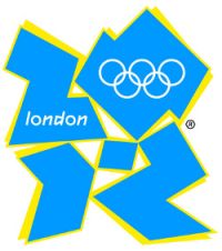
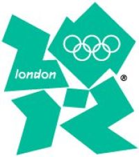
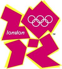
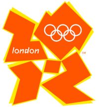
2012 London Summer Olympics Logo - Design and History
|
|
The 2012 Summer Olympic Games, officially the Games of the XXX Olympiad, and also known as London 2012 are scheduled to take place in London, United Kingdom, from 27 July to 12 August 2012. The Olympic games are a major international event in which thousands of athletes from around the globe participate in various sporting events. These include sports such as swimming, track and field, football, basketball and numerous other events. The summer Olympic games are one of the most watched television events and cities around the world compete fiercely to host an Olympic event. |
Controversy : Since the logo was unveiled, there have been a number of controversies surrounding the logo
- Iran said it would boycott the games because the logo appeared to spell the word "ZION", a biblical term that refers to Jerusalem.
- Some have complained that the logo looks like a distorted Swastika.
- Some users complained of having seizures after watching the logo on TV changing colors.
- Perhaps the most absurd one is some users with really wild imaginations have suggested that the 0 is a silhouette of Lisa Simpson performing a sexual act on the number 2. If you look closely, perhaps, but really? Was the logo designer so perverted? Maybe she is just speaking into a microphone.
The logo is fairly simple and uninspiring. London has so many wonderful monuments such as the London Eye, the Buckingham Palace or Big Ben (or Elizabeth Tower as it is now called) that could have been incorporated into the logo. Hopefully the games will be significantly more exciting with Bolt and Phelps in it.
Read more: 2012 London Summer Olympics Logo - Design and History