Pro Bowl 2012 Logo Design
The Pro Bowl is the all-star game of the National Football League (NFL). Since the merger with the rival American Football League (AFL) in 1970, it has been officially called the AFC-NFC Pro Bowl, matching the top players in the American Football Conference (AFC) against those in the National Football Conference (NFC). Currently, players are voted into the Pro Bowl by the coaches, the players themselves, and the fans.The Pro Bowl has been played in Hawaii since 1970 except for 2009 when it was held in Miami. The 2012 game will be held in Hawaii as well and will be played on Jan 29th, 2012, a week before Super Bowl XVI.
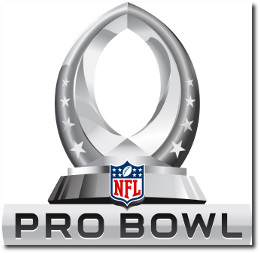
The Pro Bowl logo, just like the Super Bowl logo has been standarized in 2011 and has taken the same black & white steel feel to it. The logo consists of the following key elements
- The logo is in the shape of the Pro Bowl trophy, which is basically the shape of a football.
- There are 4 stars on each side representing the 4 conferences in the AFC (AFC North, AFC South, AFC East, AFC West) and the NFC (NFC North, NFC South, NFC East, NFC West)
- The only non black and white element of the logo is the colorful NFL logo at the bottom of the trophy.
SuperBowl XLVI 2012 Logo Design
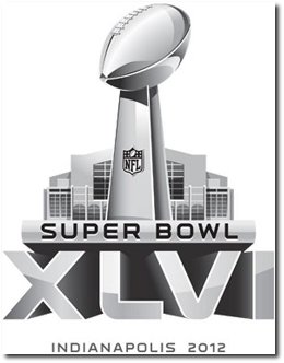 |
Super Bowl XLVI will be the 46th annual edition of the Super Bowl in American football, and the 42st annual championship game of the modern-era National Football League (NFL). The game, to be played on February 5, 2012, will pit the champions of the AFC and the NFC and will be held at Lucas Oil Stadium in Indianapolis, Indiana. This will be the first time that the Super Bowl will be held in Indianapolis. SuperBowl XLVI will be between the AFC Champions - New England Patriots and the NFC Champions - New York Giants. |
I am personally not thrilled with this decision by the NFL. If you look at the Super Bowl logos from the past you can see they each had a unique style that represented various aspects of the region, the country, the game etc. Some logos were really well designed and some were cheesy, but that was the fun of it. Going forward, all the logos are going to the equally standardized (read Boring!!!)
See all the SuperBowl Logos here.
See the SuperBowl XLII Logo and the SuperBowl XLI Logo.
Hyatt Hotel Logo - Design and History

Hyatt House is an extended stay hotel brand of the Hyatt group. Extended stay hotels are a type of lodging with features unavailable at standard hotels. These features are intended to provide more home-like amenities. Extended-stay hotels typically have self-serve laundry facilities and offer discounts for extended stays, beginning at 5 or 7 days. They also have suites with kitchens.
Hyatt House will be the new brand name of the all Hyatt Summerfield Suite hotels in addition to the ones acquired from LodgeWorks.
The logo is fairly simple and contemporary and comprises of the following elements.- The 'H' is both in lower case and uppercase
- The lowercase 'h' is in the shape of a bed while
- The uppercase H has a curved square flag in a bold blue hue. Blue is the base color of the Hyatt brand which helps it stay connected to the brand yet have its own distinctive identity.
The name Hyatt House was selected as an identifier that signals a residential, welcoming, personal and hospitable experience. Hyatt House also has historical significance as the name of the first Hyatt hotel, which opened in 1957 at Los Angeles Airport LAX.
This video gives you an insight into the new hotel room design and features.
See more World Famous Logos
Technology Logos
Car Logos
Logo Parodies
 |  |
Belkin International, Inc., is a manufacturer of computer hardware that specializes in connectivity devices, headquartered in Playa Vista, Los Angeles, California. Belkin sells in both the consumer and the commercial business-to-business (B2B) market, with various product lines including routers, iPod and iPhone accessories, mobile computing accessories, surge protectors, switches, hubs and other peripherals. Belkin has become one of the fastest growing companies in the world, with over 1,000 employees and sales topping $1 billion. They are primarily in the connectivity business.
In 2012, Belkin unveiled a new brand identity at the 2012 International Consumer Electronics Show (CES) in Las Vegas.
The logo comprises of the following elements
- The logo utlizes a series of dots of various sizes to create the image of a person. That design is in line with their philosophy of taking inspiration from people. The connect the dots theme also goes well with connecting with people.
- The new logo is also called PIP, People Inspired Products
- The font for Belkin has changed to a lower case font and more contemporary as some others have done recently such as Seattle's Best Coffee and Jack in the Box.
The new logo is a huge change from their current logo which is just the word BELKIN in a simple font. The new logo could be used in interesting ways in their products such as putting it in front of an LED and lighting up the logo. I think it will look cool in a dark room. Imagine a rack full of shining blue people with REM's "Shiny Happy People" playing in the background..
The logo was design by Wolff Olins.
Their chief brand officer put out the following Press Release as well. "The new Belkin logo, affectionately named PIP for People Inspired Products, symbolizes our commitment to take inspiration from people, and acknowledges the connection between people and the experiences they value most. In a future where connectedness will only increase, our products have one common goal, to ensure that technology exists to serve people, and never the other way around." - Chief Brand Officer Ernesto Quinteros
Washington Wizards Logo - Design and History
 |
The Washington Wizards are a professional basketball team based in Washington, D.C., previously known as Washington Bullets. They play in theNational Basketball Association (NBA), and play their home games at the Verizon Center in the Chinatown section of Washington, D.C.
The new logo also uses the red, white and blue colors whereas the previous logo had light blue, brown and black. Certain aspects of the logo have been made sharper and the wizard also appears to be at a different angle. |
BCS 2012 Logo Design
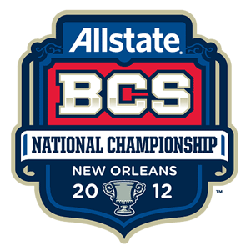 |
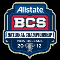
The BCS National Championship Game, or BCS National Championship, is the final bowl game of the annual Bowl Championship Series (BCS) and is intended by the organizers of the BCS to determine the U.S. national champion of the NCAA Division I Football Bowl Subdivision.The participants are the two highest-ranked teams in the BCS standings at the end of the regular college football season, currently determined by averaging the results of the final weekly USA Today Coaches' Poll, Harris Interactive Poll of media, former players and coaches, and the average of six participating computer rankings. It is sort of the Super Bowl of the college football season (but no really) and I am sure such statements will spark furious debates. The Bowl Championship Series (BCS) logo for the 2012 Allstate BCS National Championship Game is shown along side. |
The logos typically maintain a few common elements
- The top of the logo appears to have the name of the primary sponsr which in this case is Allstate Insurance company
- Its the followed by the "BCS National Championship" With BCS representing the Bowl Championship Series
- It then has the location of the game, which in this case was New Orleans
- It has the year of the game, 2012
- The final touch to the logo appears to be a football related or local element which in this case appears to be a trophy of some kind
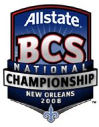
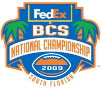
If you look at past years logos, you will see the same common theme. Variations include local elements (such as the New Orleans Saints logo in 2008 or the palm trees in South Florida) and colors (Orange and Green for South Florida). Seems like the BCS has found a theme that works and they are sticking by it. Unlike the new Super Bowl logos, which also follow a common theme but is extremely dull, the BCS logo is slightly better in the freedom it enjoys.
This year's championship game is scheduled to be played on Monday, Jan. 9, at the Louisiana Superdome. The game is between #1 ranked Louisana State University and #2 ranked Alabama.
