2010 NBA All-Star Game
 |
The 2010 NBA All-Star Game is an exhibition basketball game between players selected from the league's Western Conference and the Eastern Conference that will be played on February 14, 2010 at Cowboys Stadium in Arlington, Texas. The game will be the 59th edition of the National Basketball Association (NBA) All-Star Game and will be played during the 2009€“10 NBA season. |
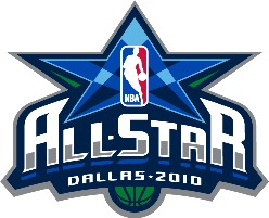
The Logo for the event is shown above and the following are some of the key elements in the logo.
- The key aspect of the logo is the is the star in light and dark blue, which are also the primary colors of the Mavericks logo. The Star is an important aspect of Texas (a.k.a Lone Star State).The Star also goes well with the "All Star" Game.
- The mix of blue lines in the logo also represent a spot light shining on the NBA Logo.
- The All Star font is very similar to the font of the Dallas Mavericks, but thats just my opinion.
- The location - Dallas 2010 is also prominent.
- The A and R are mirror images (sort of) and I am wondering if its supposed to resemble the Cowboys Stadium.
- I am not sure why the Ball is Green - wonder if they are doing something environmental.
See the history and design of some NBA Logos.
How to get the Howard Stern Show on your iPhone
 | | Hey Now!! If you have an iPhone and are a fan of Howard Stern then you like me, would want to listen to Howard Stern on the iPhone. For quite a while that was rather difficult to do because Sirius did not have an iPhone app and when they did introduce it, they did not offer the Howard Stern Channels on the iPhone app. Now (as of Jan 2010), you have two options to get Howard Stern on your
|
December 2010 Update - Stern re-signed for another 5 year deal at Sirius and he has said that Howard 100 and 101 will be part of the lineup on the iPhone/iPod.
Pocket Tunes Radio iPhone Application
Pocket Tunes Radio is an application available in the App Store ($6.99) that streams a large number of online stations. The application can also stream the content from the online Sirius feed which includes the Stern channels. In order to make this work, you will need to buy this application (one time 6.99 cost) and also have the online streaming ($2.99/month) and you are all set. The pro's of this method of listening to Stern are that you can virtually get access to the channels anywhere you are as long as you have Wifi or good data speeds. Also, the price is only 2.99/month or lower if you have annual subscriptions etc. The downside is that if you are in the car, you may get spotty signal and also crackling sound on your stereo.
iPhone Skydock for XM Radio
The iPhone Skydock is a new adapter that can be attached to a car (uses the standard charger output) and converts your iPhone into a Satellite radio. Unlike the Rocket Tunes option, the signal comes from the satellites so you are guaranteed of a better reception and signal. The problem with this is that the product comes from XM (not Sirius) so you have to subscribe to XM (for full price) and then get the Best of Sirius package. The total cost will work out to around $17/month. Also the Skydock works only in the car and costs about $120.
The Skydock communicates with your stereo over FM and in crowded markets such as NY, LA or Dallas, its tough to find a good frequency as well. The Skydock also plays your iPod as well. The Skydock does have an auxillary out so if your car stereo supports that you are in luck.
These are the two ways you can get Stern on your iPhone. Given my listening pattern (I spend about 40 mins in the car everyday) and also listen at work, I prefer option 1. I also have a Skydock that I uses mainly as an FM transmitter and have not activated my radio as yet. Maybe if Stern renews, I may consider doing that.
There are rumors that they will introduce new products at the CES and new options may show u or maybe Stern will allow them to broadcast on the Sirius application. Until then, seems like this is what we can do.
Expedia.com Logo - Design and History
Expedia is an Internet-based travel reservation website, and a part of the Expedia, Inc. based in the US with localized sites for 18 countries. It books airline tickets, hotel reservations, car rentals, cruises, vacation packages, and various attractions and services via the World Wide Web and telephone travel agents. The site uses multiple global distribution systems like Amadeus or the Sabre reservation systems for flights and for hotels, Worldspan, and Pegasus, along with their own hotel reservation system for their contracted bulk rate reservations. Expedia was started by Microsoft, which they then spun off as a multi-billion dollar company.
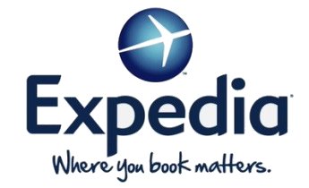
In 2009, Expedia decided to change its decade old logo (shown on right above) which was a yellow plane circling the globe. The new logo shown on the right was launched to replace the old logo. One of the executives defined that they wanted to replace the cartoonish logo with a more contemporary logo.
- The new logo maintains the airplane and the notion of globe, but the airplane sits on the top of globe, not rotate around it.
- The "Expedia" font is also different, more rounded and contemporary as well.
- The logo also gets a new tagline, "Where You Book Matters."
Jack in the Box Logo - Design and History
 Jack in the Box 2009 Logo |  Jack in the Box Old Logo |
Jack in the Box is an American fast-food restaurant founded in 1951 in San Diego, California, where it is still headquartered today. In total, the chain has 2,100 locations; primarily serving the West Coast of the United States. Most of the outlets are in California, followed by Texas, Arizona, Washington,
Jack in the Box competes primarily with other major national fast-food chains such as McDonald's, Taco Bell, Kentucky Fried Chicken and Wendy's. Food items include the Jumbo Jack, Potato Wedges, and Ultimate Cheeseburger.
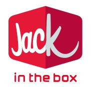
In March 2009, Jack in the Box unveiled a new corporate logo shown above alongside the old logo. The new logo is significantly different from the old logo with the following most visible change
1. The new logo is 3-dimensional and the Box clearly stands out.
2. The font is more contemporary and pleasing to the eye.
3. The focus is more on "Jack" than "in the box", and I am wondering if thats to promote the use of Jacks more than Jack in the Box.
4. Some people say that the long curve in the letter 'K' appears to be a smile (just like the Amazon logo).
They still continue to maintain the bright red, although it appears to be a bit toned down.
Overall, I like the new logo as it does give it a modern feel although some bloggers feel that the logo may not be apt for restaurant logo. What do you think? Submit your comments below.
The logo was created by Duffy & Partners.
Hertz Corporation Logo - Design and History
 Hertz Corporation 2009 Logo |  Hertz Corporation Old Logo |
The Hertz Corporation (also known as Hertz Rent a Car or simply Hertz) is the largest car rental brand in the world, with approximately 3,500 locations in the United States and 7,500 worldwide. It is headquartered in Park Ridge, New Jersey, United States. The company was begun by Walter L. Jacobs in 1918, who started a car rental operation in Chicago with a dozen Model Ts. In 1923, Jacobs sold it to John D. Hertz, president of Yellow Cab and Yellow Truck and Coach Manufacturing Company, who renamed it the "Hertz Drive-Ur-Self System". The company has passed through a number of hands, including General Motors, RCA, and United Airlines. As a public company, Hertz was traded on the NYSE under the symbol HRZ until the purchase of outstanding stock by Ford Motor Company in 1994.
Hertz's new logo leverages their signature yellow color, signifying the Company's 91-year legacy of service and innovation. In the previous logo, the font was in Yellow, but with the new logo, the Yellow color is even more prominent With a contemporary look, the logo also symbolizes Hertz's commitment to remain relevant to today's car and equipment rental customers. The new font is more contemporary with rounded edges as opposed to the old font which is more block-shaped.
According to Mike Senackerib, Hertz Chief Marketing Officer, "Our goal in the logo redesign was to create a more contemporary corporate image that reflects our strong brand recognition, and is in touch with the mindset of current and future customers who appreciate superior service, personalized choices and value. We believe, and our customer research bears out, that the new logo portrays Hertz as a modern brand with personality for business, leisure and insurance replacement renters, and equipment rental customers."
As part of its rebranding, Hertz will be also updating its worldwide facilities, including on-and-off-airport Rent-a-Car and equipment rental locations consistent with the corporate identity.
The logo was design by Landor.
2010 Vancouver Winter Olympics Logo Design
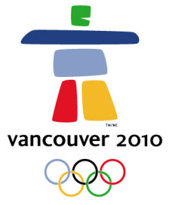 |
The 2010 Winter Olympics, officially the XXI Olympic Winter Games or the 21st Winter Olympics, is a major international multi-sport event held on February 12-28, 2010, in Vancouver, British Columbia, Canada, with some events held in the resort town of Whistler, British Columbia and in the Vancouver suburbs of Richmond, West Vancouver and the University Endowment Lands. The 2010 Winter Olympics shown alongside features a unique design of an inukshuk, a traditional stone sculpture used by Canada's Inuit people, as its official logo. The logo, called Ilanaaq (el la nawk) was designed by local graphic designers Elena Rivera MacGregor and Gonzalo Alatorre. The logo boasts five stone-like formations in green, two in blue, and one in red and yellow. Two pillars serve as the legs in support of the body, a horizontal shape acts as the arm and an eagle is where the head would normally be. The form stands over the words "Vancouver 2010" and the five Olympic rings. |
The different colours represent different regions of the country: the green and blues symbolize coastal forests, mountain ranges and islands. The red represents Canada's Maple Leaf and the yellow depicts the brilliant sunrises. Their emblem was selected by a nine-member panel and beat out over 1,600 other submissions.
