KFC Logos - Design and History
 |
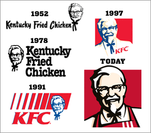
KFC, also known as Kentucky Fried Chicken, is a chain of fast food restaurants based in Louisville, Kentucky, known mainly for its fried chicken. Since 2002 KFC has been a wholly owned subsidiary of Yum! Brands, Inc.The company was founded by Colonel Harland Sanders in 1952, with the abbreviated form of its name adopted in 1991. The colonel has always been a part of the KFC logo. In the early years, you can see him to have a more serious face but over time, you can see that his face has become more friendly. Also, the red color in the logo has given the logo a more bold and lively look. In April 2007, KFC unveiled their current logo in which the Colonel shed his white suit jacket for a red cook's apron. The new logo includes bolder colors and a more well-defined visage of the late Kentucky Fried Chicken founder, who will keep his classic black bow tie, glasses and goatee. The logo is changing for only the fourth time in 50 years, and for the first time in nearly a decade. The smiling Colonel is featured against a red background that matches his red apron, with the KFC brand name in black thick lettering under his chin. |
The company also began using its original appellation of Kentucky Fried Chicken again for its signage, packaging and advertisements in the United States as part of a new corporate re-branding program; newer and remodeled restaurants will have the new logo and name while older stores will continue to use the 1991 signage. Additionally, the company continues to use the abbreviation KFC freely in its advertising. Internationally the company is still known as KFC.
Notes:
In 2011, a gentleman contacted me claiming that his grandfather Winston Maybee came up with the colonel idea (see one of the comments below). I cannot authenticate that fact but it did seem genuine for me to put it on this article.
In 2006, KFC claimed to have made the first logo visible from outer space, though Readymix has had one since 1965. KFC says "[It] marked the official debut of a massive global re-image campaign that will contemporize 14,000-plus KFC restaurants in over 80 countries over the next few years." The logo was built from 65,000 one-foot-square tiles, and it took six days on site to construct in early November. The logo measured a record-breaking 87,500 square feet (8,129.0 m²),and was placed in the Mojave Desert near Rachel, Nevada.
http://www.kfc.com/facefromspace/popup_video.asp
Shown below are all the previous logos for KFC.

Source: http://en.wikipedia.org/wiki/KFC
http://www.foxnews.com/story/0,2933,229308,00.html
The KFC logos are a registered trademark. Use of the logo here does not imply endorsement of the organization by this site.
See more World Famous Logos
Technology Logos
Car Logos
Logo Parodies